 |
Weather Eye with John Maunder |
https://www.climate4you.com/Text/Climate4you
One example of what is contained in the above website are the charts of Arctic and Antarctic air temperatures from January 2000 to February 2022.
Each month Professor Ole Humlum of the The University Centre in Svalbard (UNIS), in Norway publishes on the web his very comprehensive web site updating a large number of charts and related analyses of data from international sources such as NASA.
His latest website can be found at: www.climate4you
HadCRUT4 is a global temperature dataset, providing gridded temperature anomalies across the world as well as averages for the hemispheres and the globe as a whole. CRUTEM4 and HadSST3 are the land and ocean components of this overall dataset, respectively.
These datasets have been developed by the Climatic Research Unit (University of East Anglia) in conjunction with the Hadley Centre (UK Met Office), apart from the sea surface temperature (SST) dataset which was developed solely by the UK Hadley Centre.

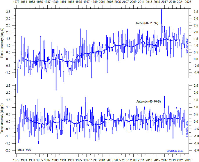
Global monthly average lower troposphere temperature since 1979 for the northern (60-82.5N) and southern (60-70S) polar regions, according to Remote Sensing Systems (RSS). These graphs uses data obtained by the National Oceanographic and Atmospheric Administration (NOAA) TIROS-N satellite, and interpreted by Dr. Carl Mears (RSS). Thick lines are the simple running 37 month average, nearly corresponding to a running 3 yr average. Click here for a description of RSS MSU data products. Please note that RSS January 2011 changed from Version 3.2 to Version 3.3 of their MSU/AMSU lower tropospheric (TLT) temperature product. Click here to read a description of the change from version 3.2 to 3.3, and previous changes. Last month shown: February 2022. Last diagram update: 10 March 2022.
*********************************
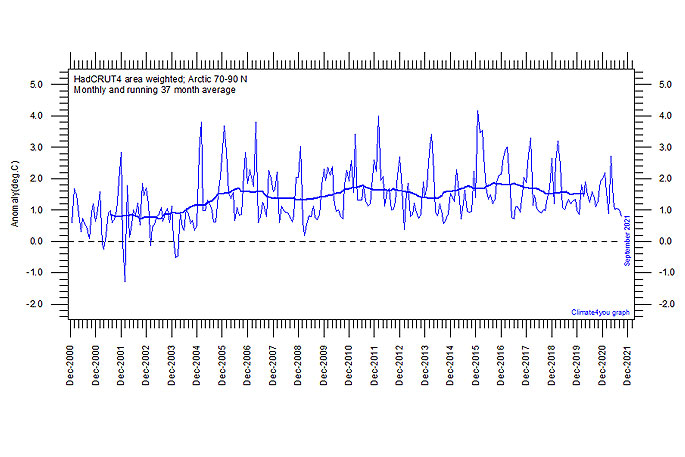
The chart below shows area weighted Arctic (70-90 degrees N) monthly surface air temperature anomalies (HadCRUT4) since January 2000, in relation to the WMO normal period 1961-1990.
The thin line shows the monthly temperature anomaly, while the thicker line shows the running 37-month (c. 3 year) average.
The chart shows little change over the last 20 years.

The chart shows area weighted Arctic (70-90 degrees N) monthly surface air temperature anomalies (HadCRUT4) since January 2000, in relation to the WMO normal period 1961-1990.
The thin line shows the monthly temperature anomaly, while the thicker line shows the running 37-month (c. 3 year) average.
The chart shows little change over the last 20 years.

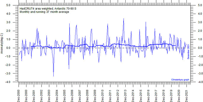
Diagram showing area weighted Antarctic (70-90 N) monthly surface air temperature anomalies (HadCRUT4) since January 2000, in relation to the WMO normal period 1961-1990. The thin line shows the monthly temperature anomaly, while the thicker line shows the running 37-month (c. 3 year) average. The chart shows little change over the last 20 years.
For further information on a range of weather/climate matters see my recent book "Fifteen shades of climate" (Amazon)

